Prototype — Open Projects Hub
Historical prototype (pre-ADR-020). These screens and notes use the original Viewer role. Viewer accounts were later replaced by account-free Client Review through a project access code (ADR-020), and the shipped roles are Admin and Member. Read "Viewer" here as "client reviewing by access code".
UI/UX prototype for the MVP planning experience, built in Pencil (.pen file) with reusable components and design tokens.
Files
| File | Purpose |
|---|---|
README.md | This file — directory overview and quick start |
prototype-brief.md | Authoritative source of truth: page definitions, user flows, scope, requirements coverage matrix |
design-direction.md | Visual direction, color strategy, typography, component inventory, accessibility, responsive breakpoints |
pen/open-projects-hub.pen | Interactive Pencil design file with 12 screens and 12 reusable components |
Opening the Prototype
The .pen file opens in Pencil — a collaborative design tool.
# File location
open-projects-hub-docs/docs/05-prototype/pen/open-projects-hub.pen
Open it from Pencil via File → Open and navigate to the path above, or use the Pencil CLI.
Screens Preview
Static exports of the 12 core pages, so the prototype can be browsed without opening Pencil. Modal, empty, and validation-error states aren't captured here — see the full artboard list below or open the .pen file for those.
| Screen | Preview |
|---|---|
| Landing / Home | 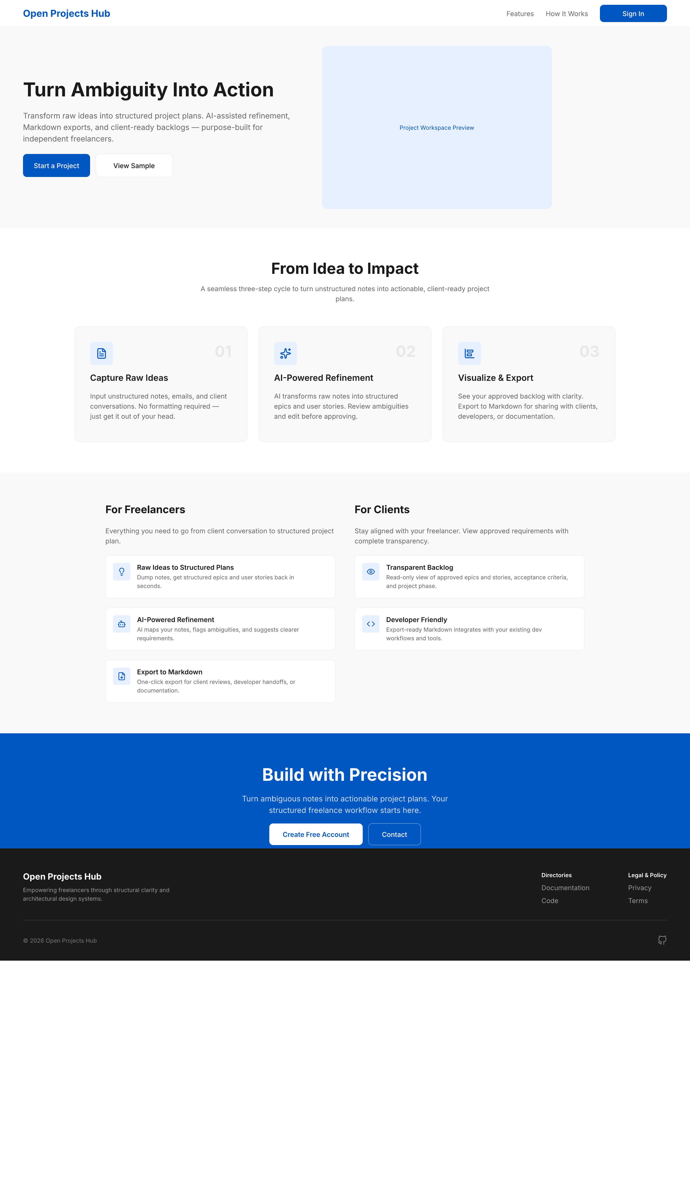 |
| Entry & Role Selection | 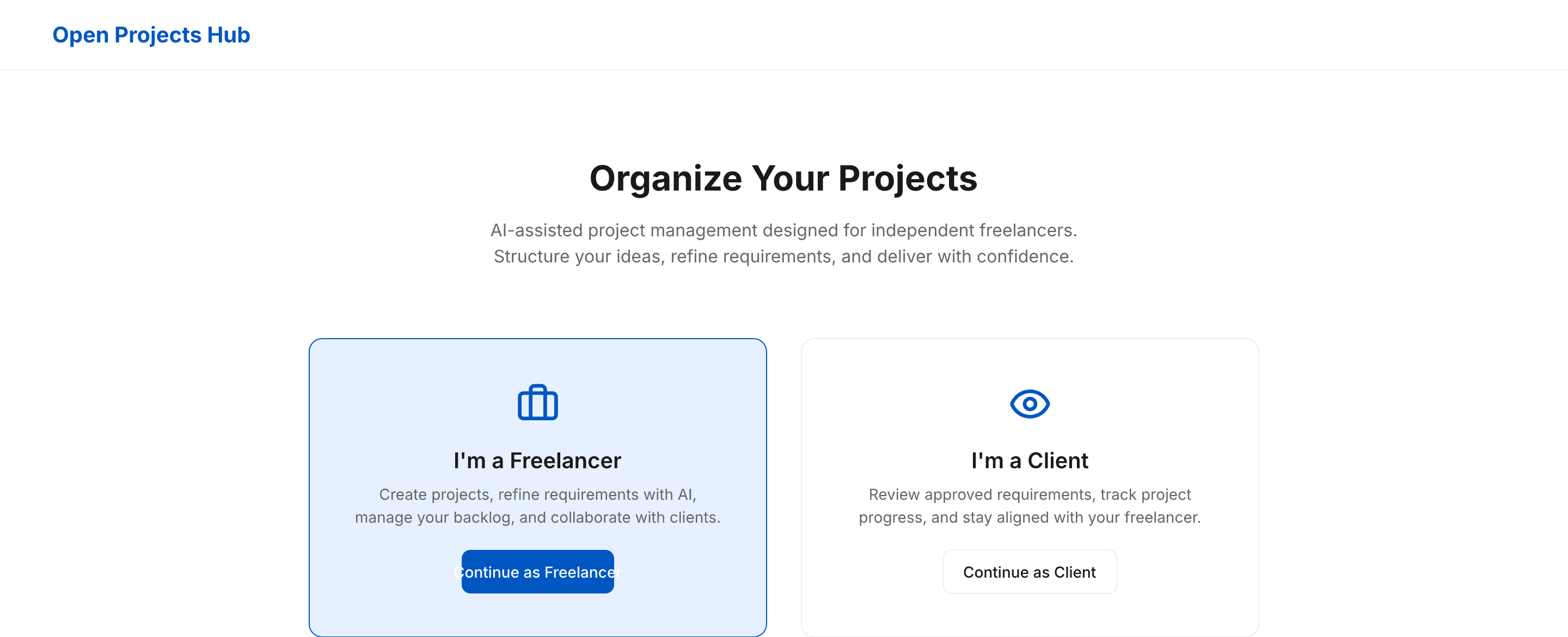 |
| Admin Sign Up | 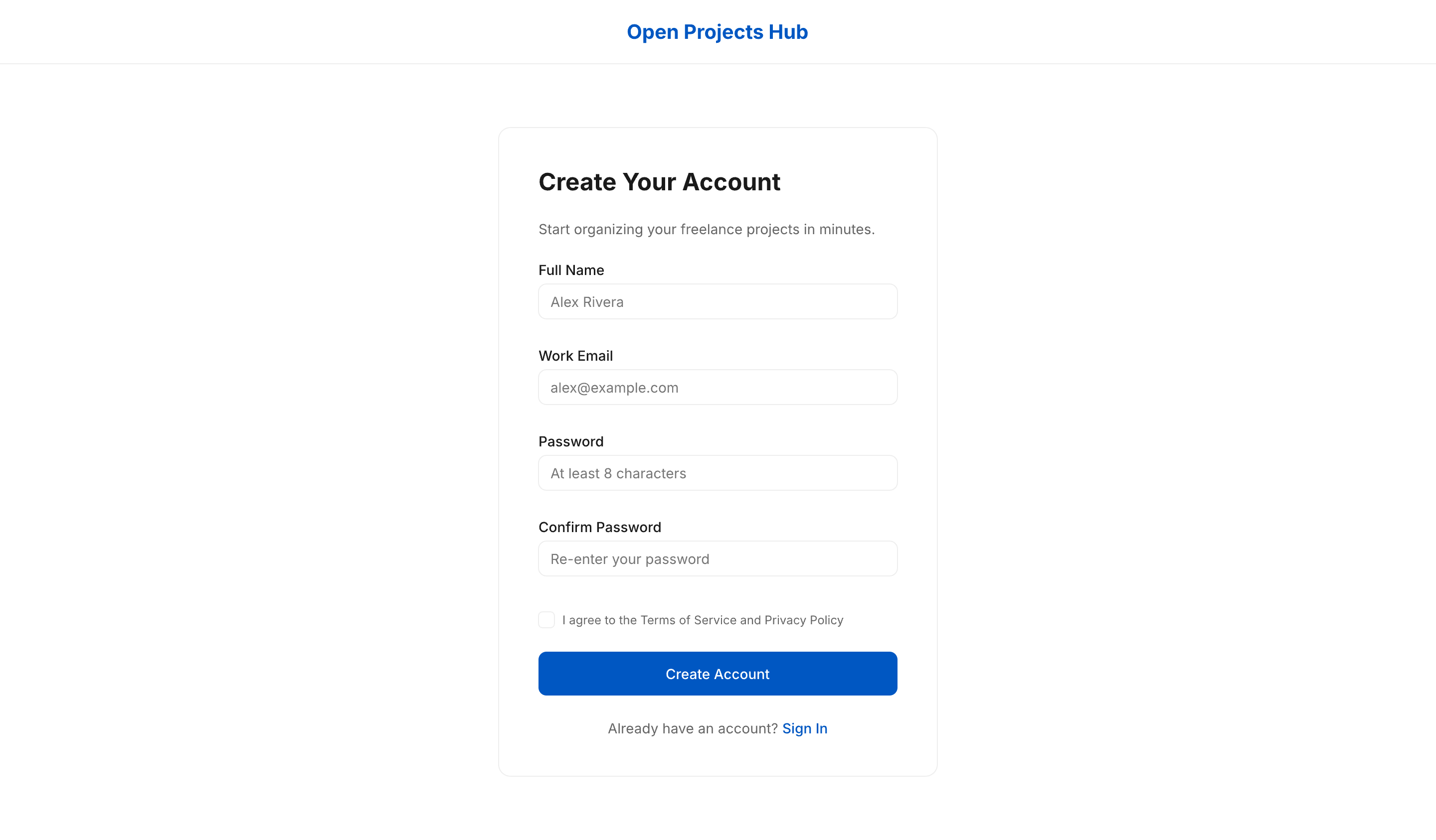 |
| Admin Sign In | 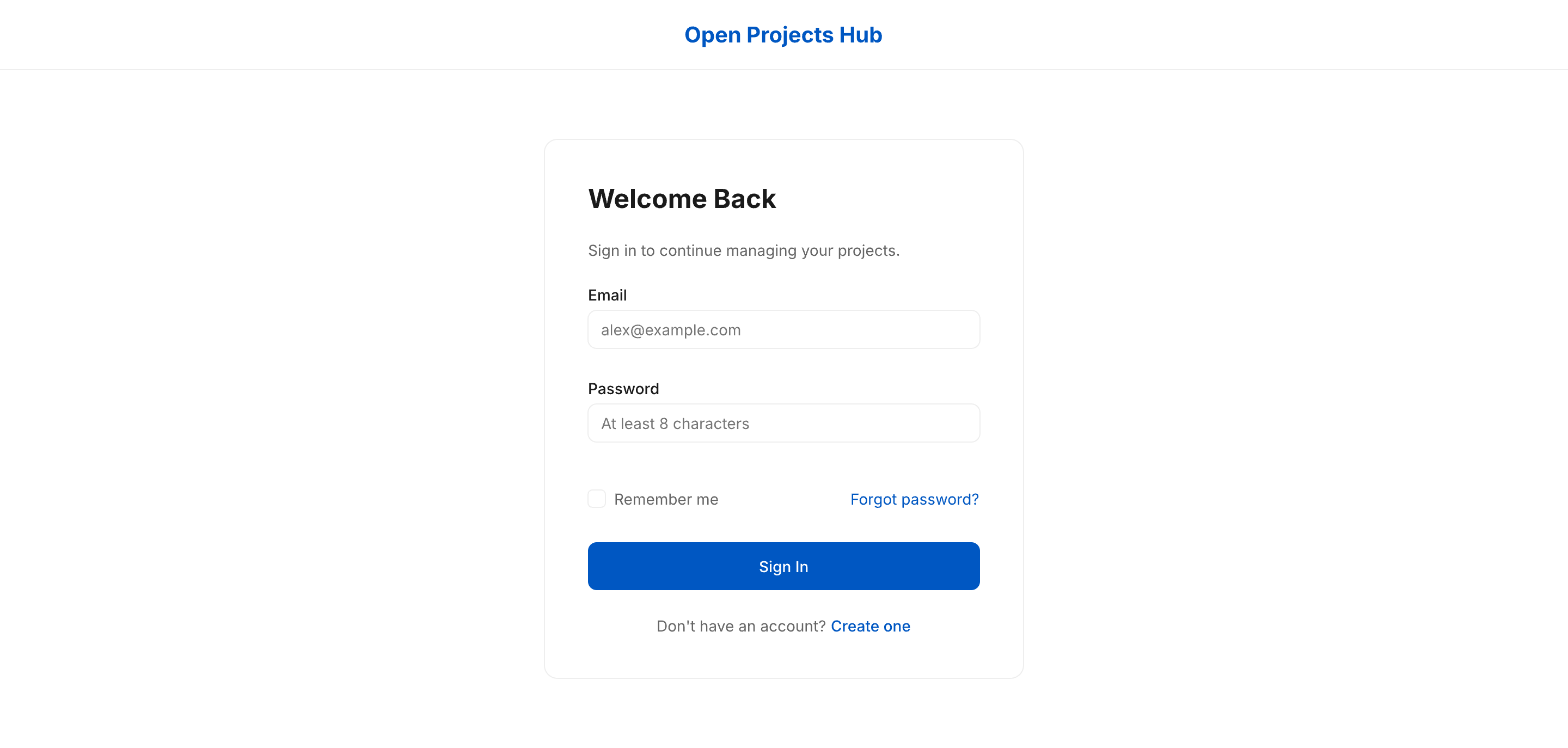 |
| Forgot Password | 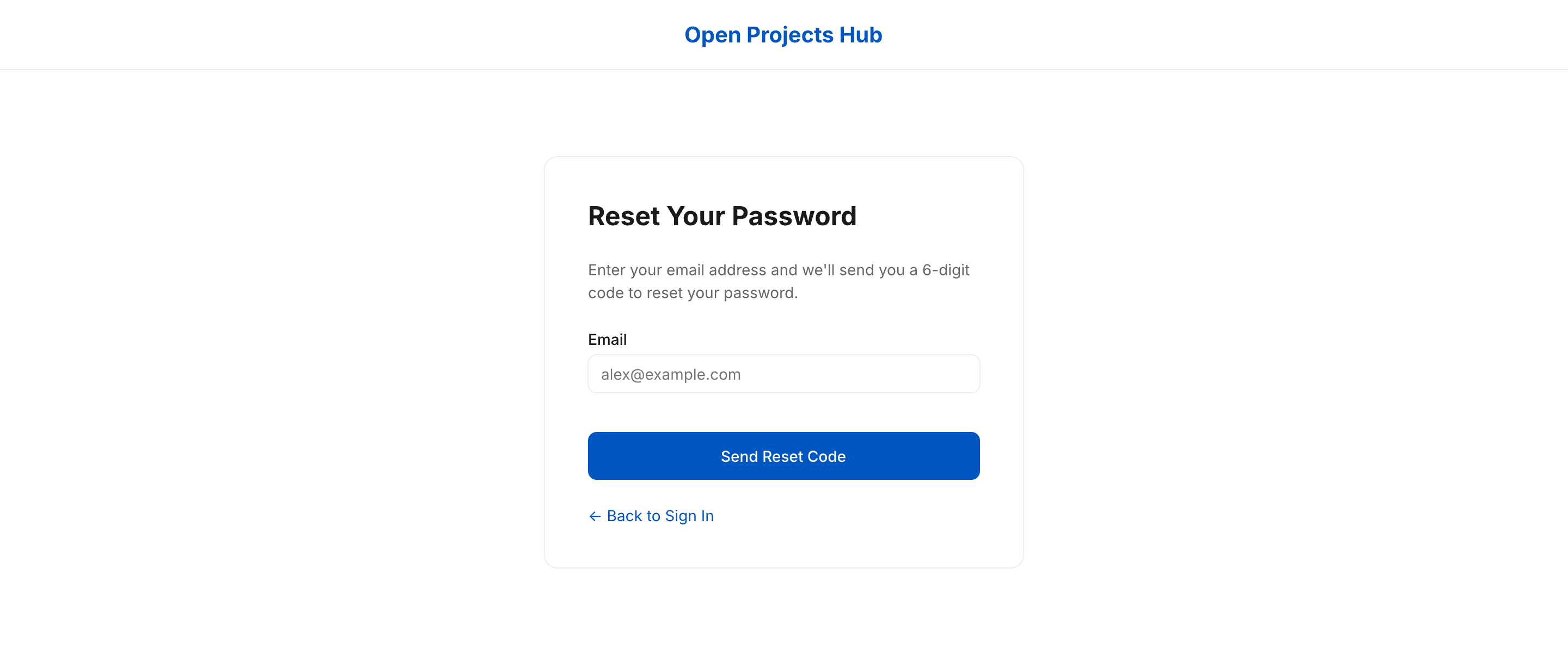 |
| Reset Password | 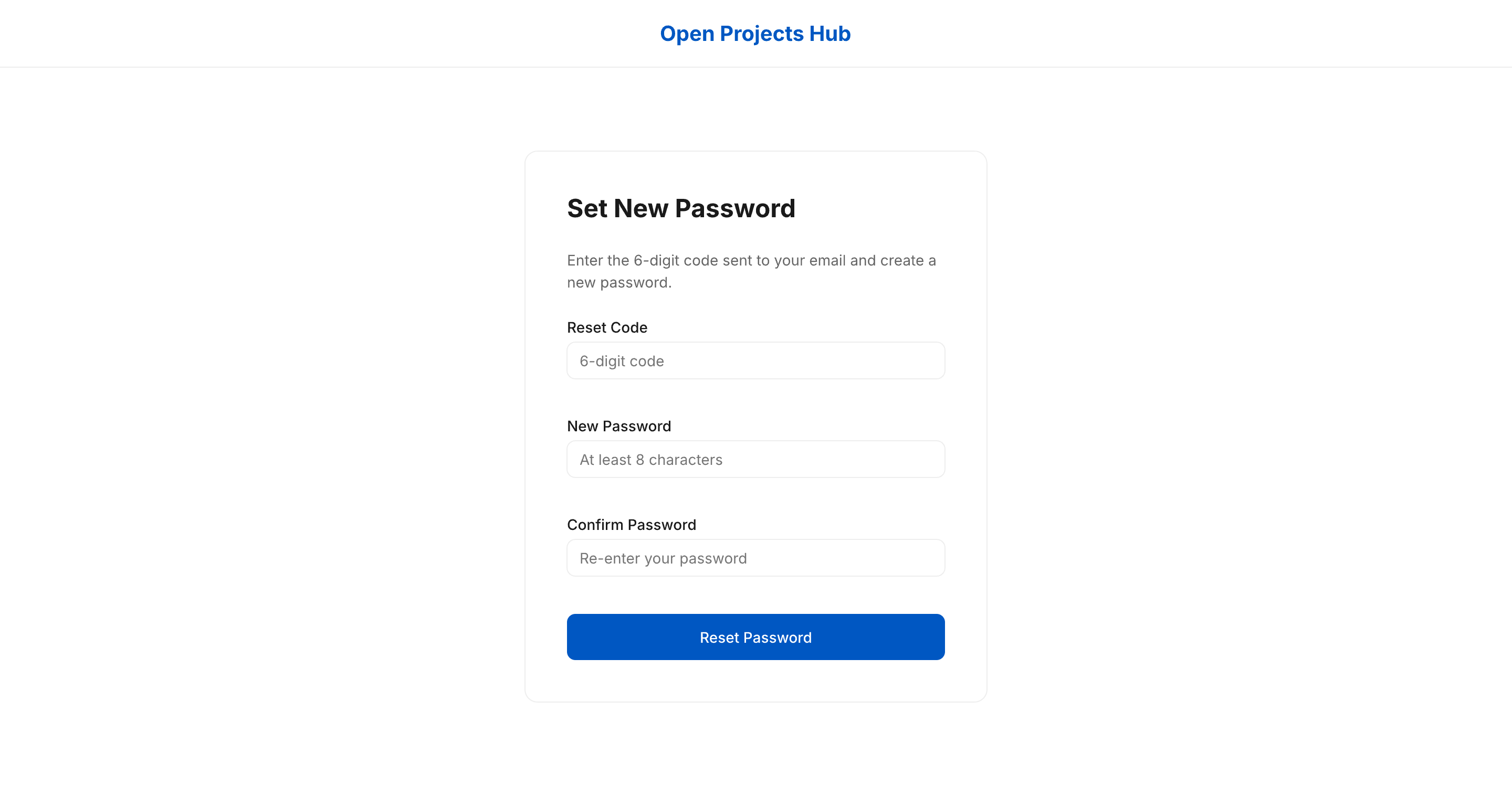 |
| AI Refinement Workspace | 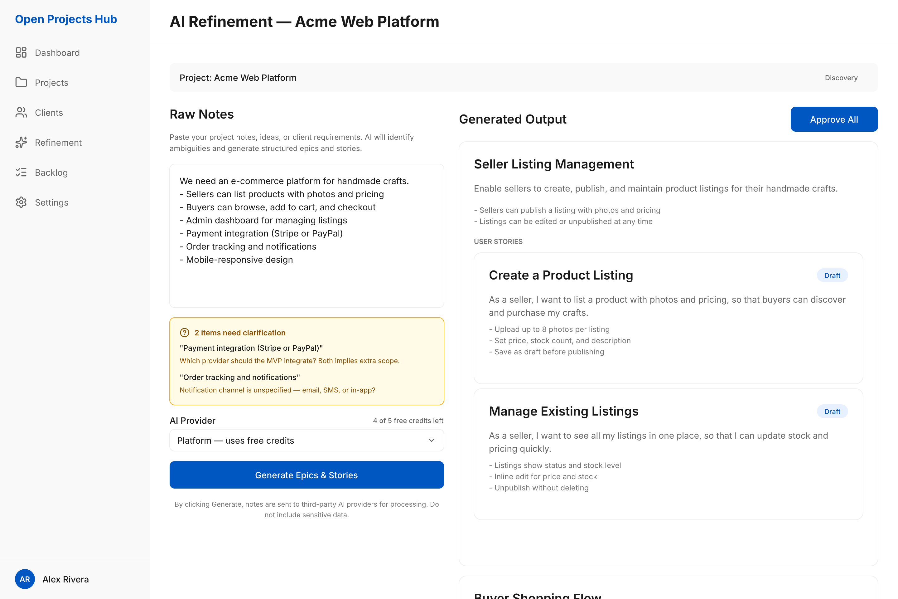 |
| Admin Backlog | 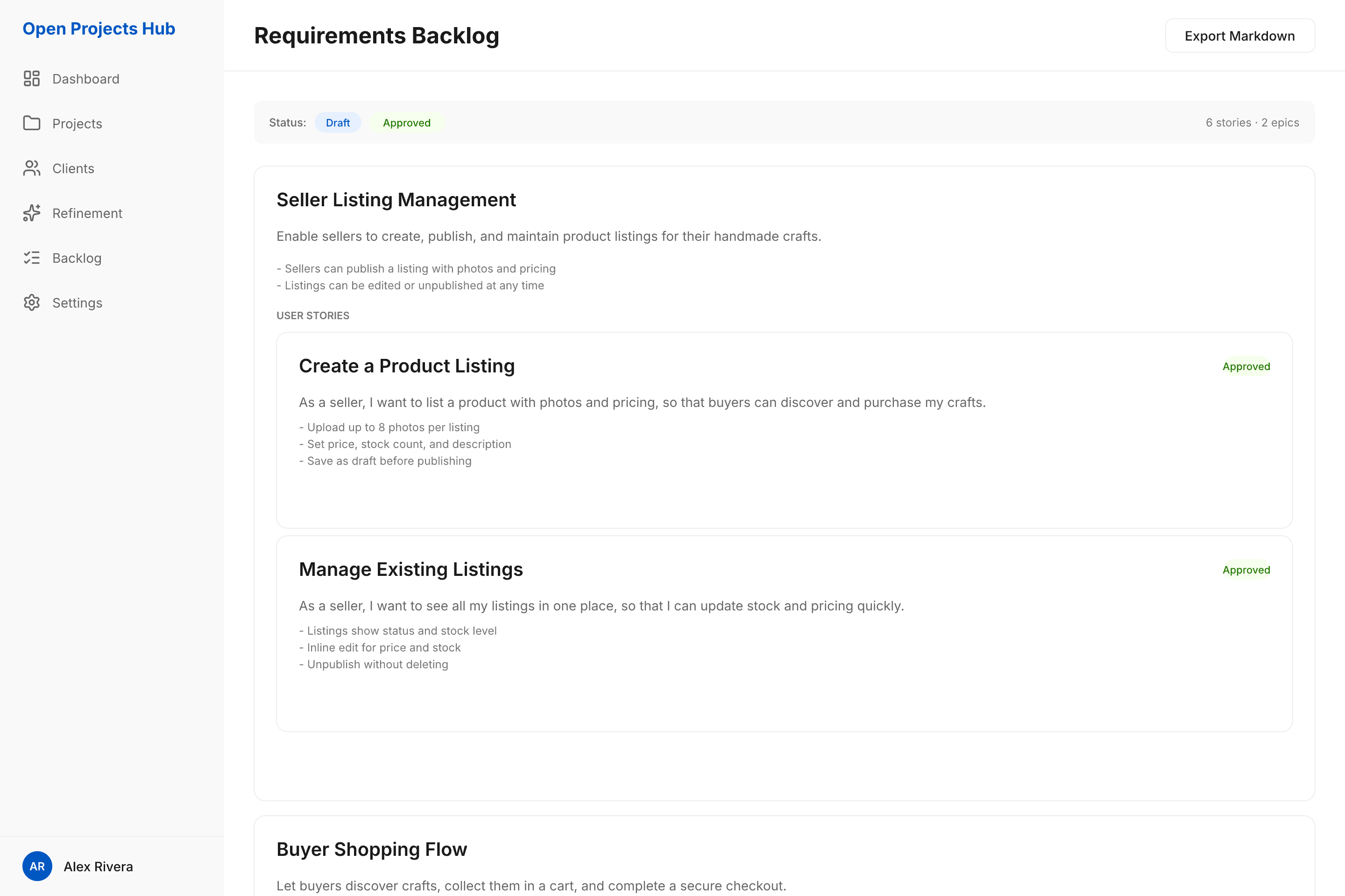 |
| Admin Dashboard | 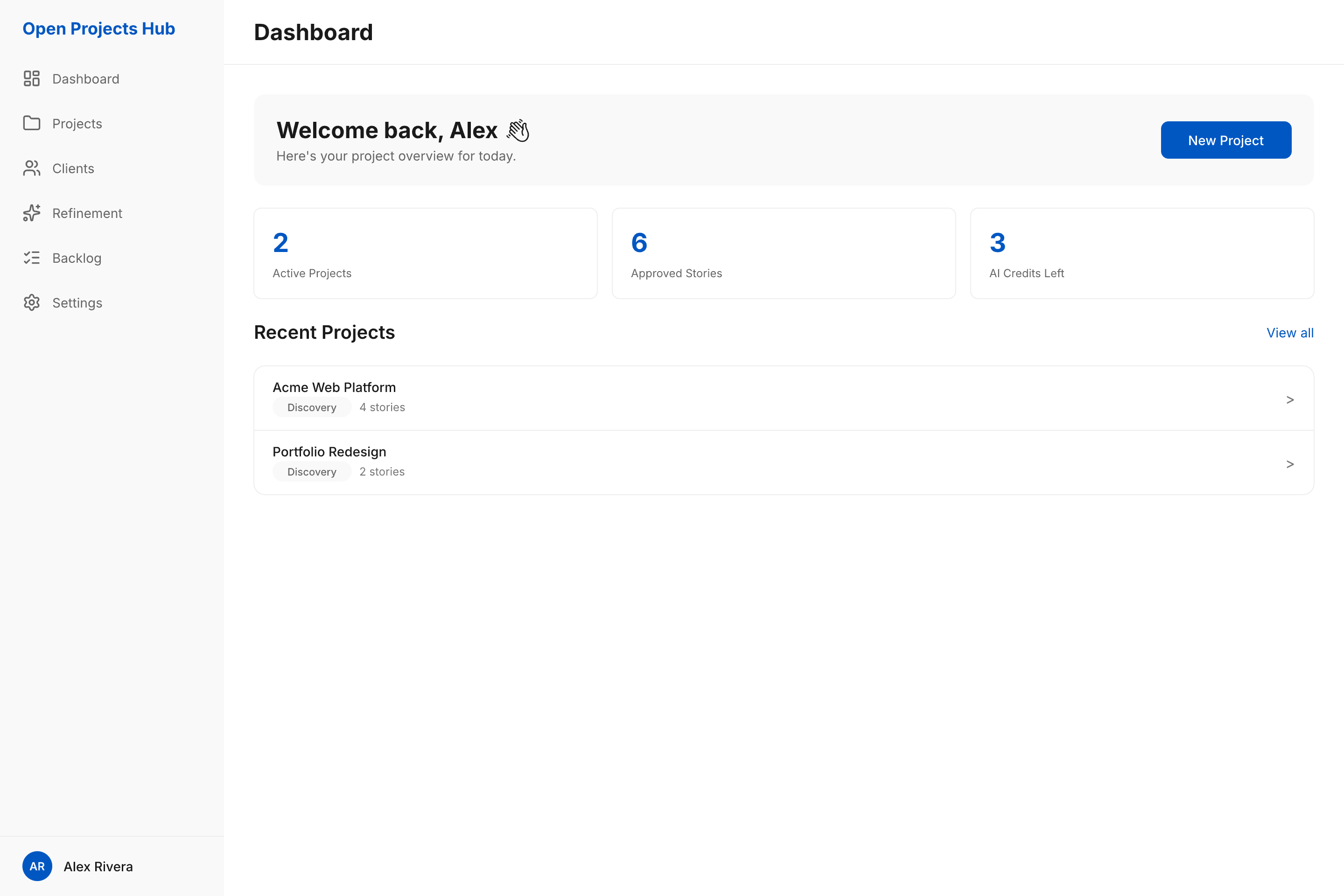 |
| Admin Settings | 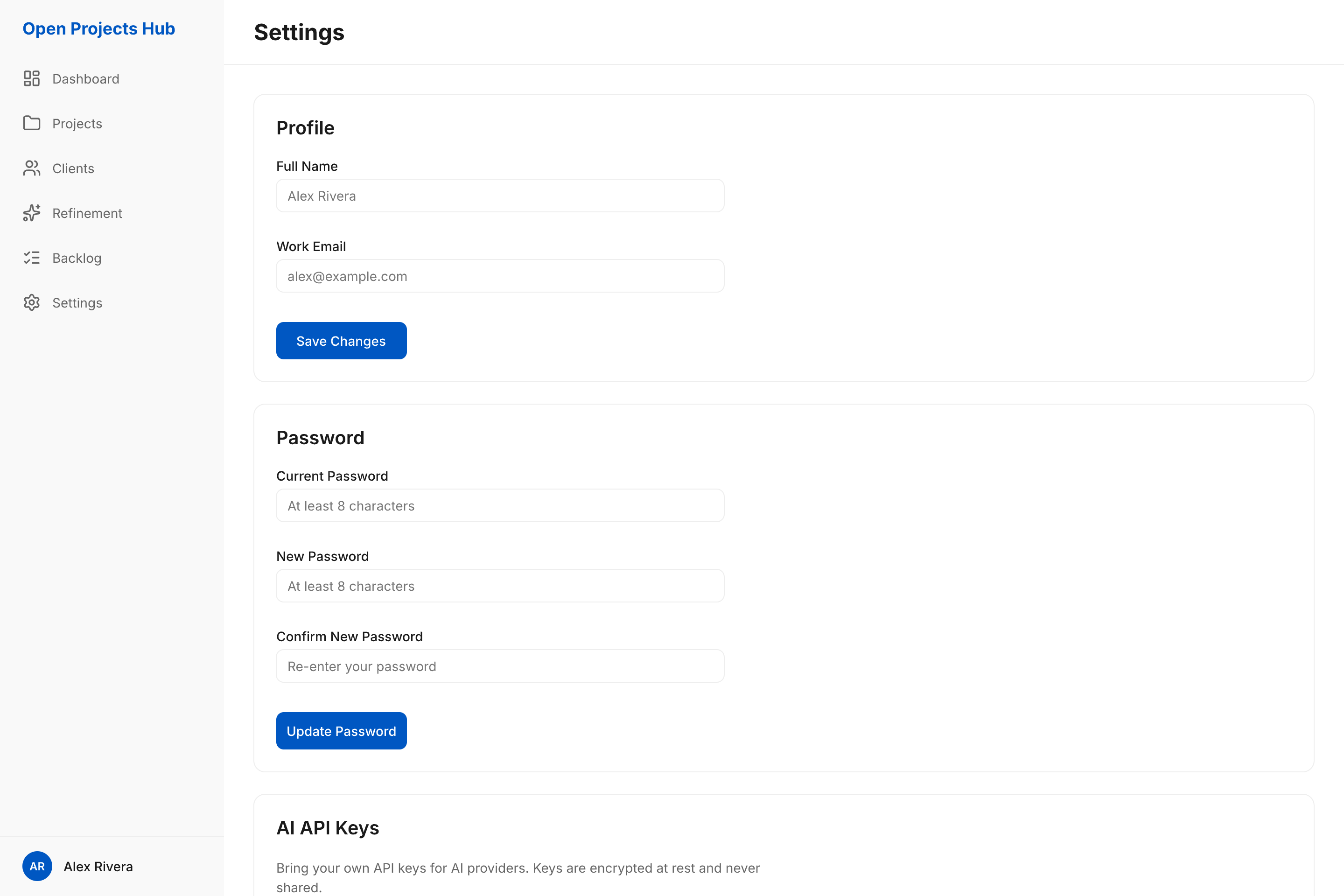 |
| Viewer Backlog | 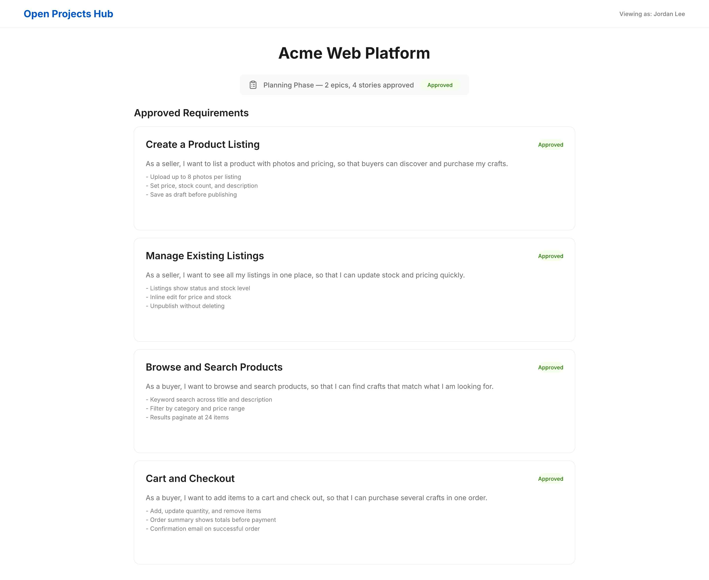 |
| Onboarding Overlay | 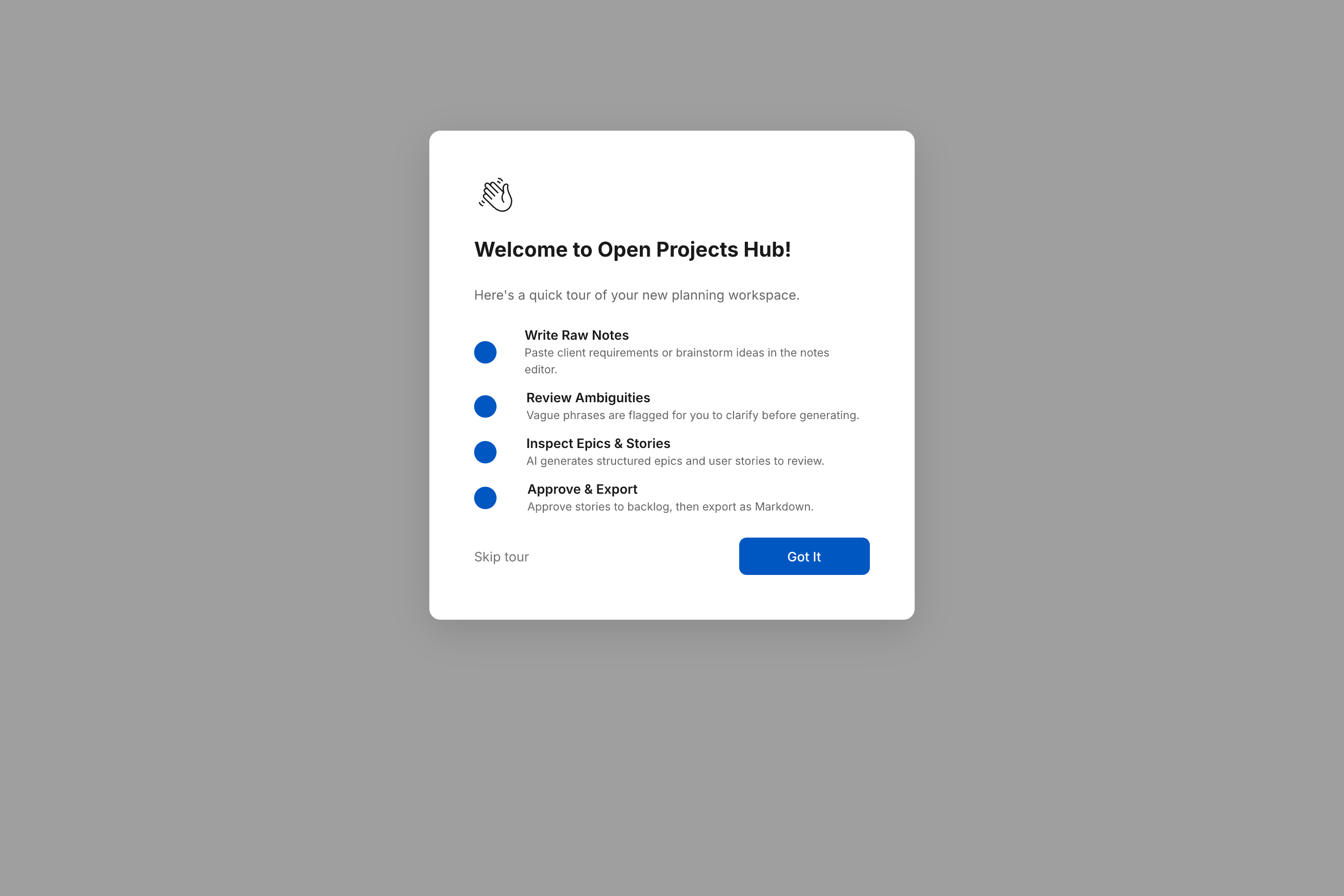 |
What's Inside
22 Artboards
| # | Artboard | Layout | Key Features |
|---|---|---|---|
| 1 | Landing / Home | Public | Hero, features grid, info cards, CTA section, footer |
| 2 | Entry & Role Selection | Public | Two role cards (Admin / Viewer) with CTAs |
| 3 | Admin Sign Up | Public | Registration form: name, email, password, confirm, terms |
| 4 | Admin Sign In | Public | Email + password, remember-me, forgot/create links |
| 5 | Forgot Password | Public | Email capture for reset code |
| 6 | Reset Password | Public | 6-digit code + new password + confirm |
| 7 | AI Refinement Workspace | Admin | Split-pane: raw notes → generated epics & stories, ambiguity bar, provider + credits, approve |
| 8 | Admin Backlog | Admin | Filter bar, epic + story list, Markdown export |
| 9 | Admin Dashboard | Admin | Welcome card, stats (projects/stories/credits), recent projects list |
| 10 | Admin Settings | Admin | Profile, password, API keys management, danger zone |
| 11 | Projects | Admin | Search + status/client/date filters, project rows with phase & status |
| 12 | New Project | Admin | Name, client, phase, description, active-slot hint |
| 13 | Clients | Admin | Client list, search, per-row Edit + Archive-or-Delete (FR-001-04) |
| 14 | Viewer Backlog | Public | Read-only stories with status tags, phase badge, no edit controls |
| 15 | Onboarding Overlay | Overlay | 4-step welcome tour: notes, ambiguities, epics & stories, approval |
| 16 | Privacy Policy | Public | Legal content page |
| 17 | Terms of Service | Public | Legal content page |
| 18 | Modal: Project Limit Reached | Overlay | Blocks a 4th active project; prompts to archive (FR-001-02, FR-001-07) |
| 19 | Modal: Client Delete Blocked | Overlay | Blocks deleting a client with active projects (FR-001-04) |
| 20 | Modal: New Client | Overlay | Client name + contact email, Cancel/Create |
| 21 | Projects — Empty | Admin | Empty state before any project exists |
| 22 | New Project — Validation Error | Admin | Inline alert + field error state for a missing project name |
17 Reusable Components
| Component | Type |
|---|---|
Button/Primary | Filled blue button |
Button/Secondary | Outlined button |
Tag/Draft | Blue-light pill |
Tag/Approved | Green pill |
Tag/Phase | Surface pill (Discovery/Planning) |
FormField | Label + bordered input |
StoryCard | Title + description + acceptance criteria |
EpicCard | Title + description + criteria + nested story cards |
SiderNavItem | Icon + label navigation item |
Sider | Sidebar: logo, 6 nav items, user area |
AdminLayout | 240px sider + page header + scrollable content body |
AmbiguityBar | Flagged phrases with clarification reasons |
Select | Label + control with chevron |
Alert | Inline error/warning message with icon |
EmptyState | Icon + title + description + CTA |
ListRow | Primary/secondary text + tags + row actions |
Modal | Dimmed overlay + centred card with actions |
47 Design Tokens
Colors ($primary, $surface, $text-primary, $success, $warning, $error, etc.), spacing scale (4px grid, 7 tiers), typography (Inter, 5 sizes, 4 weights), layout constants (sider widths, radii, shadows).
Scope
The prototype covers the MVP Discovery and Planning workflows only. Out of scope: delivery, sprint, handoff, collaboration, and maintenance workflows.
Source References
Last Updated: 2026-09-09